People visit stores not only for shopping, but also to get emotions and ideas. Shopping online means that you get anything and it will be delivered to your home, but when shop online, a person will be looking for interesting decisions, how the thing the person buys will fit the future interior, why does the space without it will be not so cozy, sincere and lively.
Everything impacts – colouring of layout, background, composition, comfortable placement of labels, physical availability of goods – so it not scary to reach it, there would be no feeling that if you take one, the item next to it will fall down (thus people just will be afraid to take goods into their hands and will pass by).

Window has to attract and beckon with its aesthetic, exclusiveness. Also no to seem alien, unapproachable as a museum exposition – buyer should associate the layout with own home, that these things can be taken and purchased.
That’s why it is so important that laws of merchandising and developments in art and aesthetical solutions would be observed. When choosing winners, I was taking into consideration right these notes.
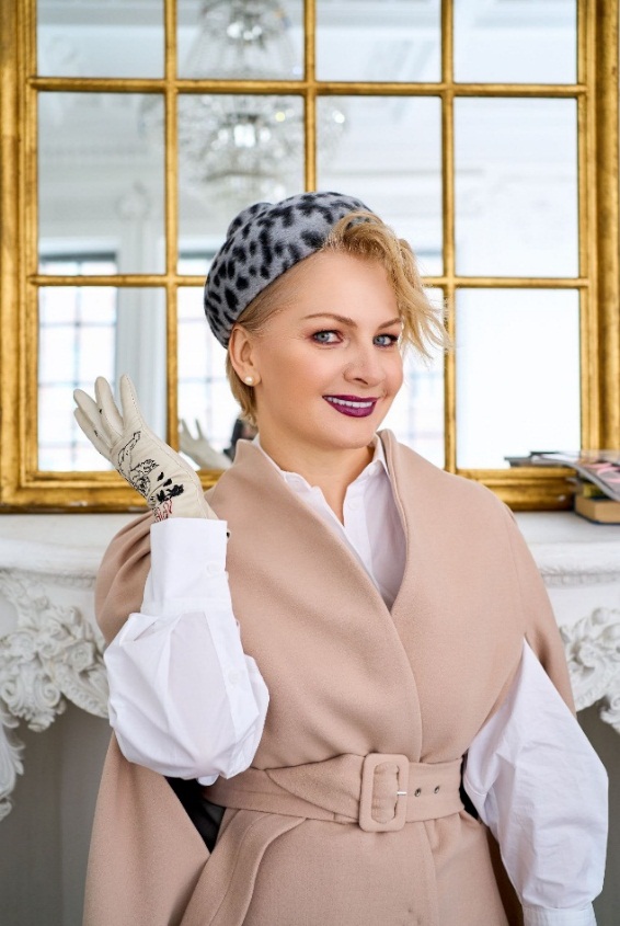
Natalia Preobrazhenskaya
Designer, art expert, an owner of a top interior studio 'Uyutnaya kvartira’, a partner of the leading developers of Moscow, influencer and enlightener in interior design.
18 years in the business, more than 1500 implemented objects of total volume more than 80 000 square meters (an equivalent of 3,5 Red Squares or 11 football fields of FIFA).
